
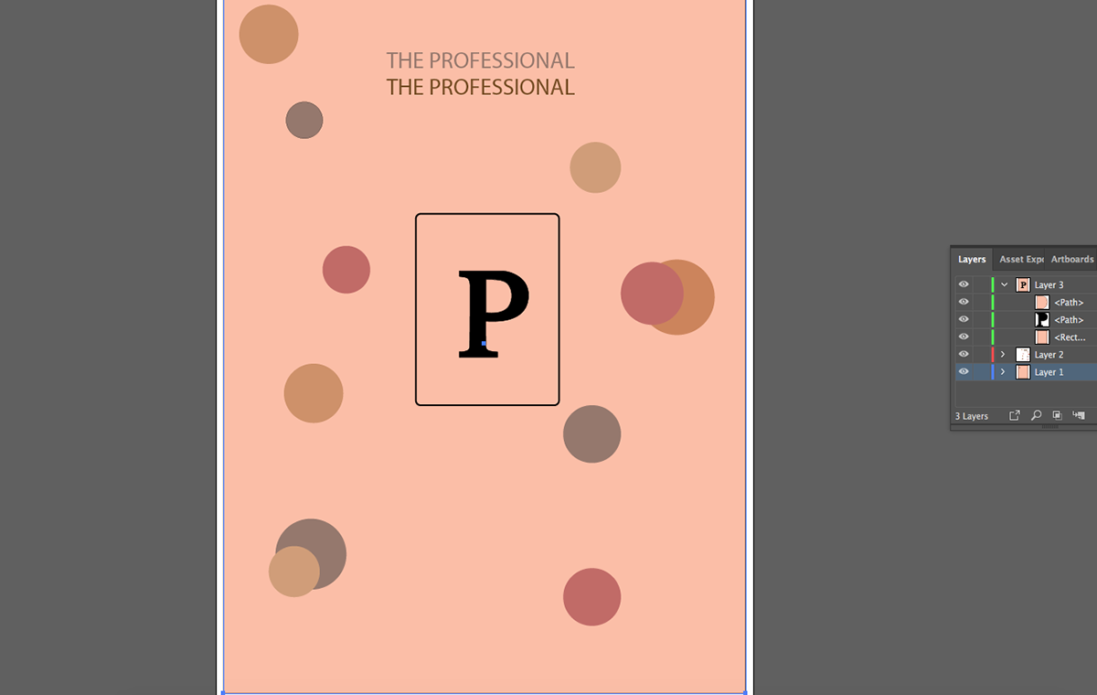


Once again we see a return of “the Professional”. When creating this project I had regained my access to Adobe accounts. This meant I had to find my original color scheme and build from there. For this poster I was mainly forced on layout design so I wanted to keep it as simple as I could with less wording. For this layout I kept different color dots to represent the different types of skin meaning; dry skin, normal skin, combination skin meaning a mix of oil and dry, and oily. I didn’t run into any issues with this project and I like how it came out.


